🥃 TREMOR RESERVE IV Order by 9/11 — Order Details in post #259

How many bottles would you likely order?

  • 1

    Votes: 25 28.7%
  • 2

    Votes: 40 46.0%
  • 3

    Votes: 12 13.8%
  • 4

    Votes: 6 6.9%
  • 5

    Votes: 1 1.1%
  • 6

    Votes: 2 2.3%
  • 7

    Votes: 0 0.0%
  • 8

    Votes: 1 1.1%

  • Total voters
    87
The topographical underlayment could work. Mocked it up today, and a would print the topo maps on clear vinyl and then the regular label would be put on top of that. I'll have to figure out how to get the first label onto the bottle cleanly as it's an adhesive label and getting it straight with the backing removed will be a bit of a challenge.

View attachment 266834
View attachment 266835
View attachment 266836
Very nice! Definitely cheaper this way than to have the topography etched onto the bottle (which would be ideal like Found North).
 
Very nice! Definitely cheaper this way than to have the topography etched onto the bottle (which would be ideal like Found North).
Yeah, when you're doing thousands of bottles that's possible. Although if someone wants to buy me a laser engraver and all the bits needed to engrave the bottles, we could give that a shot.
 
I hit “interesting “ but in a positive way.
No doubt it’s out of the question, but a frosted map would be badass!
Frosted would be possible with the right stickerl. I've ordered a small set of the clear vinyl stickers. I wonder how clear they really are. If they're slightly opaque, that could be like a light frosted label.

Seems overly complicated to have two overlays.
Unfortunately, the white text in the label necessitates the two labels as I can't print white (no white ink in my inkjet). I would want the clear label for the map lines as I'd want the whiskey to show through the label.

Tremor I had a smaller label than the others. Tremor 2 was printed on white label paper. Labels for Tremor 3 and beyond will be printed on glossy vinyl sticker paper.
 
Frosted would be possible with the right stickerl. I've ordered a small set of the clear vinyl stickers. I wonder how clear they really are. If they're slightly opaque, that could be like a light frosted label.


Unfortunately, the white text in the label necessitates the two labels as I can't print white (no white ink in my inkjet). I would want the clear label for the map lines as I'd want the whiskey to show through the label.

Tremor I had a smaller label than the others. Tremor 2 was printed on white label paper. Labels for Tremor 3 and beyond will be printed on glossy vinyl sticker paper.
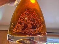
My wife is crafty. She frosted a bunch of these for racing swag racing Daytona.
I have no idea how long it took. She made the stencils and used glass etcher. Or some witchcraft. Maybe wiggled her nose?
image.webp
 
Either way, I'm curious what the non-rye drinkers think of this release. When doing the pick, we had one that was a more traditional rye profile and this one was really unique and we thought brought something special.

Heh... laugh at me. It's whisky, I'll drink it.

But I do like rye. ;)
 
Ok, got to create a real demo of the bottle with the underlayment behind the TR IV label.

@The Evil Twin - the clear label isn't 100% clear, rather it is slightly opaque.

Biggest challenge is getting the label on with no air bubbles and the contours of the bottle create some bunching at the top and bottom. Not sure this will look great, but sharing in case most would like their bottles labeled like this.

Laser etched would be the best way to go, but would have to do that before the bottles are filled.

1000031145.webp
1000031144.webp
1000031143.webp
 
Dude, that’s awesome!
The taper of the bottle is a pain in the ass o bet.
 
Dude, that’s awesome!
The taper of the bottle is a pain in the ass o bet.
the other thing I tried to account for is The Whiskey Blendery's label on the "front" side of the bottle. They apply both the front and rear labels by hand and they're not exactly in the same place each time (they don't have a label machine like many other distillery's / bottling plants have). So I cut the label a little short to give some room for the label to it doesn't overlap. That's the main part that isn't sitting quite right with me.

1000031146.webp
 
the other thing I tried to account for is The Whiskey Blendery's label on the "front" side of the bottle. They apply both the front and rear labels by hand and they're not exactly in the same place each time (they don't have a label machine like many other distillery's / bottling plants have). So I cut the label a little short to give some room for the label to it doesn't overlap. That's the main part that isn't sitting quite right with me.

View attachment 266926
What if the TR label wasn’t as wide? Like maybe only went to the middle of the side of the bottle. It’s hard to visualize. Might not really portray the fact that it is a map.
 
Ok, got to create a real demo of the bottle with the underlayment behind the TR IV label.

@The Evil Twin - the clear label isn't 100% clear, rather it is slightly opaque.

Biggest challenge is getting the label on with no air bubbles and the contours of the bottle create some bunching at the top and bottom. Not sure this will look great, but sharing in case most would like their bottles labeled like this.

Laser etched would be the best way to go, but would have to do that before the bottles are filled.

View attachment 266913View attachment 266914View attachment 266915
Looks awesome! When people get lower towards the map, they can see which trail they're drinking on 😄.
 
What if the TR label wasn’t as wide? Like maybe only went to the middle of the side of the bottle. It’s hard to visualize. Might not really portray the fact that it is a map.
I think most seem to want to keep the visual consistency of the label size. The reason the label is as tall as it is was to be able to fully cover the Blendery's rear bottle label. TR II's labels were just a touch short, so I made the labels taller. We could take a little of the width away, but don't think we gain much and it doesn't eliminate the other issues with the clear label (air bubbles, bunching at the corners, where to start/end the label on the other side).

I'd hate to do this and it not look great, and I'm honestly not thrilled with how the test bottle turned out.. Maybe for the spring or fall 2027 releases (if this project still has interest from forum members), we can explore getting a bunch of bottles laser engraved with a topo map around the entire bottle, making it a signature look for our ongoing releases.

If anyone wants to have the underlayment on their bottles, I'm happy to print and send both labels to you with your bottles so you can put them on to your liking.

If anyone wants to buy me this laser printer for future releases...

 
Last edited:
I think most seem to want to keep the visual consistency of the label size. The reason the label is as tall as it is was to be able to fully cover the Blendery's rear bottle label. TR II's labels were just a touch short, so I made the labels taller. We could take a little of the width away, but don't think we gain much and it doesn't eliminate the other issues with the clear label (air bubbles, bunching at the corners, where to start/end the label on the other side).

I'd hate to do this and it not look great, and I'm honestly not thrilled with how the test bottle turned out.. Maybe for the spring or fall 2027 releases (if this project still has interest from forum members), we can explore getting a bunch of bottles laser engraved with a topo map around the entire bottle, making it a signature look for our ongoing releases.

If anyone wants to have the underlayment on their bottles, I'm happy to print and send both labels to you with your bottles so you can put them on to your liking.

If anyone wants to buy me this laser printer for future releases...

Secret Santa request? 🤷‍♂️ Lol
 
Tremor Gofundme!
 
I think most seem to want to keep the visual consistency of the label size. The reason the label is as tall as it is was to be able to fully cover the Blendery's rear bottle label. TR II's labels were just a touch short, so I made the labels taller. We could take a little of the width away, but don't think we gain much and it doesn't eliminate the other issues with the clear label (air bubbles, bunching at the corners, where to start/end the label on the other side).

I'd hate to do this and it not look great, and I'm honestly not thrilled with how the test bottle turned out.. Maybe for the spring or fall 2027 releases (if this project still has interest from forum members), we can explore getting a bunch of bottles laser engraved with a topo map around the entire bottle, making it a signature look for our ongoing releases.

If anyone wants to have the underlayment on their bottles, I'm happy to print and send both labels to you with your bottles so you can put them on to your liking.

If anyone wants to buy me this laser printer for future releases...

I get that. It’s really hard to comprehend spacing and size from here.
Now you have my wife wanting a CO2 engraving machine. Thanks 😂
 
I get that. It’s really hard to comprehend spacing and size from here.
Now you have my wife wanting a CO2 engraving machine. Thanks 😂
Here's an idea... Y'all get a CO2 laser engraver, I can get you the empties for engraving for TR 5 and it helps to justify the investment 🤪
 
we can add $20 per bottle for next year and it will be paid for! Or start adding the cost this run and when the spring release comes, you would have nearly enough to purchase it for the fall release
 
Back
Top Bottom